
Data analysis is a critical component of decision-making in various fields, from business to healthcare to scientific research. One of the simplest yet effective tools in data visualization is the strip chart. Also known as dot plots, strip charts are particularly useful for comparing distributions and identifying patterns within datasets. This article will guide you on how to use strip charts effectively for data analysis, helping you gain deeper insights from your data.
Understanding Strip Charts
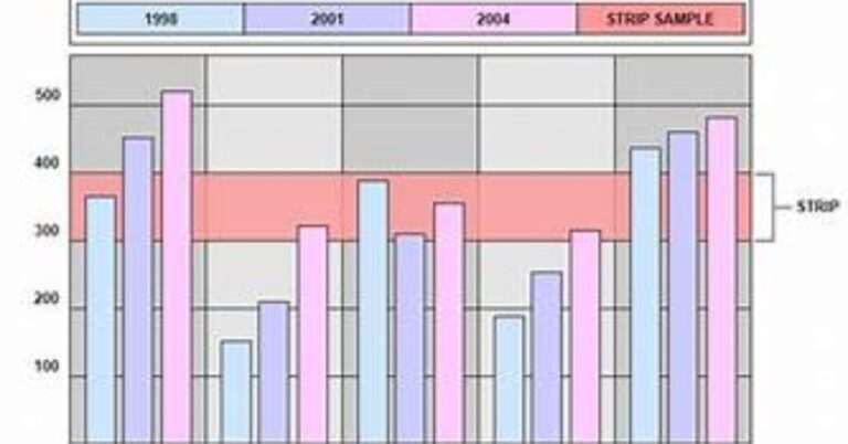
Strip charts are one-dimensional scatterplots that display individual data points along a single axis. Unlike histograms or box plots, which aggregate data into bins or categories, strip charts show each data point distinctly. This makes them ideal for visualizing small to moderate-sized datasets where preserving the individuality of data points is essential.
For instance, if you’re analyzing the test scores of students from different classes, a strip chart can show you not only the overall distribution of scores but also highlight outliers and clustering of data points. This level of detail can be crucial when making data-driven decisions.
When to Use Strip Charts
Strip charts are particularly useful in the following scenarios:
- Comparing Small Datasets: If you’re working with a small dataset, strip charts can provide a clear visual representation of each data point. Unlike bar charts or histograms, which might lose the granularity of small datasets, strip charts ensure that every data point is visible.
- Identifying Outliers: Strip charts make it easy to spot outliers in your data. Since each data point is plotted individually, outliers stand out clearly, allowing you to assess whether they are errors, anomalies, or significant findings.
- Visualizing Data Distribution: While strip charts don’t aggregate data like histograms, they do offer a visual sense of distribution. You can see where data points are concentrated and where there are gaps, giving you a quick understanding of the dataset’s structure.
- Comparing Multiple Categories: Strip charts are effective for comparing multiple categories or groups within a dataset. By placing strip charts side by side, you can easily compare the distributions of different groups, such as different demographic categories or experimental conditions.
Creating a Strip Chart
Creating a strip chart is straightforward, whether you’re using statistical software like R, Python’s Matplotlib, or even Excel. Here’s a step-by-step guide to creating a strip chart:
- Collect and Prepare Your Data: Ensure your data is clean and formatted correctly. Each variable or category you want to compare should be in a separate column.
- Choose the Right Tool: Depending on your proficiency and the complexity of your data, choose a tool that best suits your needs. R and Python are excellent for detailed and customized strip charts, while Excel is suitable for simpler visualizations.
- Plot the Data: In your chosen tool, plot each data point along the axis that represents your variable of interest. Typically, the x-axis will represent categories or time intervals, while the y-axis shows the data points.
- Customize the Chart: Add labels, adjust point sizes, and choose appropriate colors to make your strip chart clear and informative. Highlight outliers or significant data points if necessary.
- Analyze the Chart: Once your strip chart is created, take time to analyze it. Look for patterns, outliers, and trends that might not have been obvious from the raw data.
Advantages of Strip Charts
Strip charts offer several advantages that make them a valuable tool in data analysis:
- Simplicity: Strip charts are straightforward to create and interpret. They don’t require complex statistical knowledge, making them accessible to a wide range of users.
- Clarity: By displaying individual data points, strip charts provide a clear and detailed view of the dataset. This is particularly useful when you need to communicate findings to non-experts.
- Flexibility: Strip charts can be used in various fields, from scientific research to business analytics. Their simplicity and versatility make them suitable for many types of data.
- Highlighting Outliers: Unlike aggregated plots, strip charts make it easy to spot outliers and anomalies. This can be crucial in identifying errors or significant findings in your data.
Limitations of Strip Charts
While strip charts are useful, they do have some limitations:
- Scalability: Strip charts are not ideal for large datasets. When too many data points are plotted, the chart can become cluttered and difficult to interpret. In such cases, histograms or box plots might be more appropriate.
- Lack of Aggregation: Strip charts show individual data points but don’t provide aggregated measures like mean, median, or mode. If you need a summary of your data, you’ll need to complement strip charts with other types of plots.
- Overlap of Data Points: In cases where multiple data points have the same value, they may overlap on the chart, making it difficult to discern the actual number of data points.
- Limited Statistical Insight: While strip charts are excellent for visualizing raw data, they don’t offer the same statistical insights as more complex plots like box plots or violin plots.
Best Practices for Using Strip Charts
To make the most of strip charts in your data analysis, consider the following best practices:
- Use Appropriate Axes: Ensure your axes are scaled appropriately for the data being plotted. This helps prevent data points from clustering too closely or spreading out too thinly.
- Combine with Other Charts: For a comprehensive analysis, combine strip charts with other types of plots, such as box plots or histograms. This allows you to visualize both individual data points and aggregate measures.
- Label Clearly: Always include clear labels for your axes and data points. This ensures that anyone viewing the chart can easily understand what is being presented.
- Highlight Key Data Points: If certain data points are of particular interest, consider highlighting them with different colors or markers. This draws attention to critical parts of your data.
- Avoid Overcrowding: If your dataset is large, consider using a subset of the data or applying jitter (a small random noise) to prevent data points from overlapping. This ensures your strip chart remains clear and readable.
Applications of Strip Charts
Strip charts are widely used across various domains due to their simplicity and effectiveness. Here are some common applications:
- Healthcare: In medical research, strip charts are often used to compare patient outcomes across different treatment groups. They help researchers identify variations and outliers in patient responses.
- Education: Educators use strip charts to analyze student performance, comparing scores across different classes, subjects, or demographic groups.
- Business: In business analytics, strip charts are used to visualize sales data, customer feedback, or employee performance, allowing companies to identify trends and outliers.
- Scientific Research: Scientists use strip charts to display experimental results, particularly when comparing multiple conditions or variables.
Conclusion
Strip charts are a powerful yet simple tool for effective data analysis. They offer a clear visual representation of individual data points, making them ideal for small datasets and situations where identifying outliers is crucial. While they do have limitations, when used appropriately, strip charts can provide valuable insights that more complex plots might overlook. By following best practices and combining strip charts with other data visualization tools, you can enhance your data analysis and make more informed decisions.